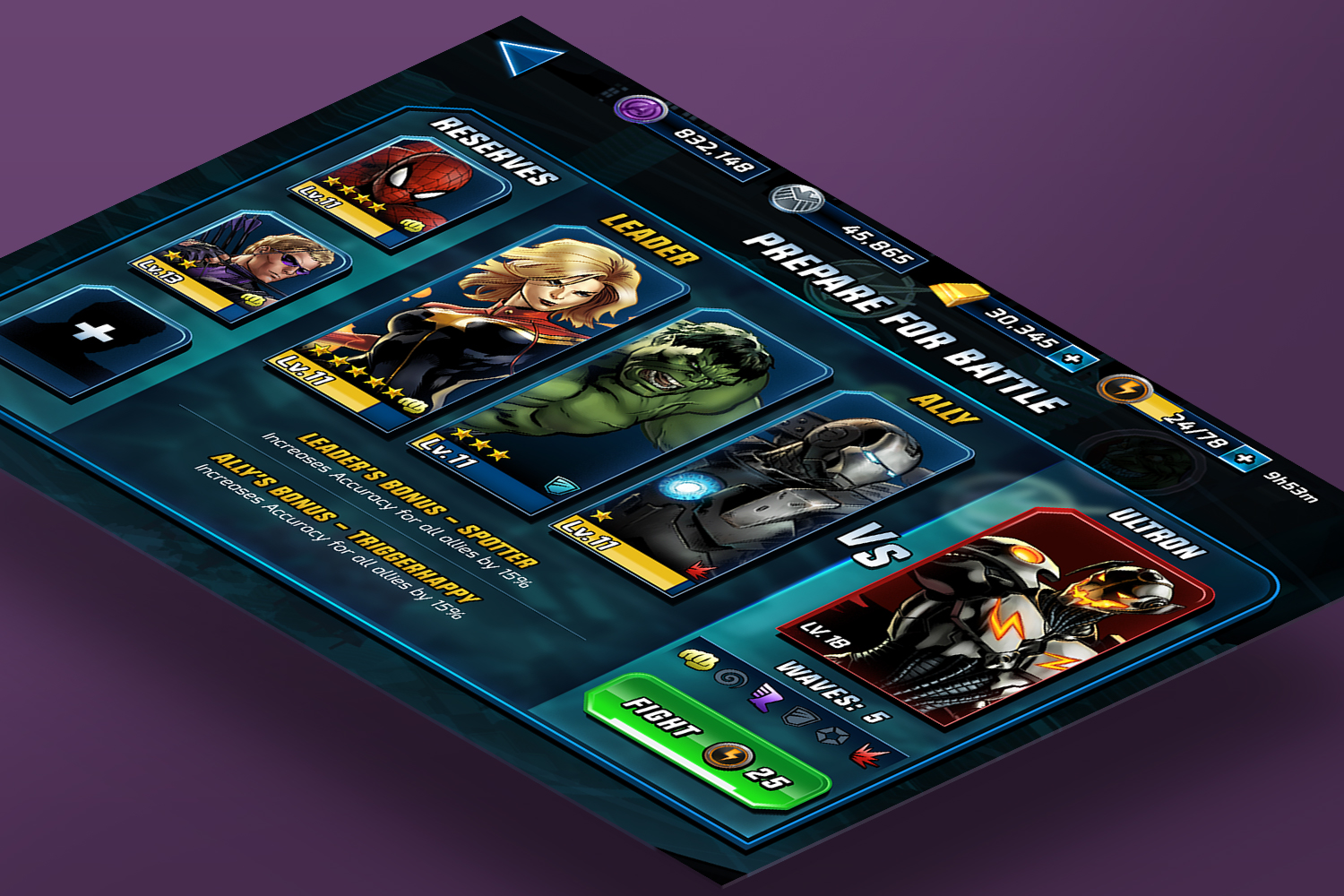
Avengers Alliance 2
We worked closely with one of Disney's internal game studios to develop the target look and feel for the mobile game's UI. We also refined the UX and clean up the information that would reduce the cognitive load for mobile users.

Marvel Avengers Alliance 2
We worked closely with one of Disney's internal game studios to develop the target look and feel for the mobile game's UI.

Reducing cognitive load
We also worked closely with the team to refine the UX and clean up the information that would reduce the cognitive load for mobile users.

Modern take on Comic UI
The team needed a cohesive look that matched the game's comic book inspired art direction, and it was an exciting task to take on while the game was deep into production.

A S.H.I.E.L.D. UI Look
While the UI was consistent with the comic book art direction style, we wanted to adopt the same shape language and colors that are embedded in the S.H.I.E.L.D. branding that is well-known to Marvel fans.

Focusing on the Heroes
Especially being a Marvel title, we wanted to visually create a story and communicate the conflict between the heroes and the villains through layout and imagery.
